Henry Robinson's Data Science Portfolio 2021
Covid-19 cases for UK regions
My First embedded chart
1 Covid chart using the government API and 1 using downloaded CSV data
Handwritten Json Chart
2 charts making use of APIs
Data Story Chart (Attended the Friday Talking Economics Lectures)
Meredith Crowley said that manufacturing always becomes smaller since the service sector keeps growing. This chart shows the change in percentage value added to GDp from each sector and whislt the downwards trend in manufacturing is clear the service sector trend is less convincing and not what we would have expected. Therefore, this chart negates the claim and calls for further analysis of high tech quarternary sector growth in this period to see if it is the cause for the fall in manufacturing
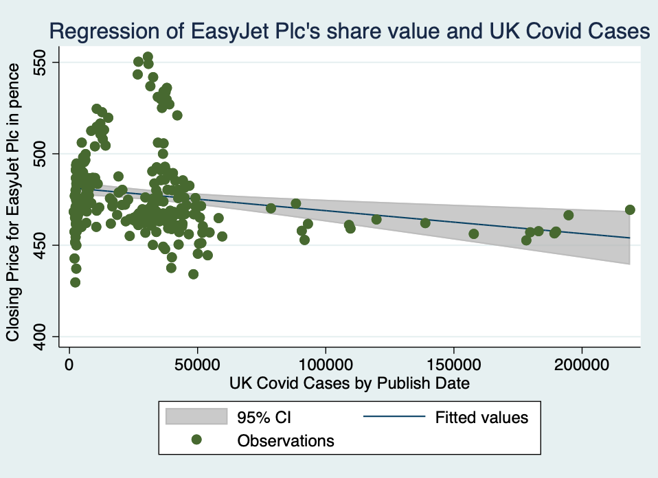
A chart made using 2 different data sources and charted charted with a regression line and 95% confidence intervals
EasyJet share value data from Polygon API and Covid data from the government API API FILE DOWNLOADER DO FILE